
Write something

Aug 22 in
Symbols, Archetypes, & Associations to Appeal to Charity; American Red Cross, 1917
- A/S = Solution/"Product" Awareness ("I know war relief efforts exist, I've heard of Red Cross."), Sophistication Stage = Stage 2, developing a stronger appeal than competitors. the ad enlarges and emotionally deepens the war relief appeal. - The ad jumps straight into the appeal of helping restore families and hearths back to their true warmth, after so being so deeply affected by ruthless destruction of war. - Very clear emotional reasoning, - Curates the archetype of the Caring, Gentle Mother to associate with the efforts of the brand. The GREATEST MOTHER in the WORLD Stretching forth her hands to all in need; to Jew or Gentile, black or white; knowing no favorite, yet favoring all. - immediate identity appeal to Christians in the biblical language, cultural non-racist appeal during struggling race relations - poetic language Ready and eager to comfort at a time when comfort is most needed. Helping the little home that's crushed beneath an iron hand by showing mercy in a healthy, human. way; rebuilding it, in fact, with stone on stone, replenishing empty bins and empty cupboards; bringing warmth to hearts and hearths too long neglected. - This ad was for WW1 relief efforts, around 1917-18 (mostly medical aid here in the states, and more physical rebuilding in European fronts). - Probably a welcomed, humanitarian effort that took no sides and wanted only to help rebuild - tugging emotional heartstrings of torn families, vivid imagery of empty homes Seeing all things with a mother's sixth sense that's blind to jealousy and meanness; seeing ...(???)... as naughty children snatching, biting, bitter-but with a hidden side that's quickest touched by mercy. - again evoking the symbol of the kind mother, an archetypal association to help build and communicate the humanitarian message. - developing that archetype through imagery and associations of child-care Reaching out her hands across the sea to No Man's land; to cheer with warmer
3
2
New comment Sep 4

Aug 22 in
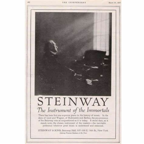
Powerful Positioning Linked to Legacy, Status, and Cultural Authority; Steinway
- A/S = Solution/Product Aware copy, Stage 1/2 Sophistication; just a ramped up message of "we're the best, and we can prove it" - Such powerful positioning, tapping into the reality of this audiences reverence for music that has lasted, and will last, for centuries. Takes this idea all the way out to literal comparison with immortality, leveraging the cultural and authority of famous composers and users of a Steinway - The boldness of the claim matches the intensity of the craftsmanship and status of the Steinway THE INDEPENDENT STEINWAY The Instrument of the Immortals - Is there anyone doing positioning like this anymore? - Connecting the desire of musicians "legacy" with the instrument There has been but one supreme piano in the history of music. In the Avys of Last and Wagon, of Rubinstein and Berlion, the pre-eminence of the Steinway was unquestioned as it is today. - Making (hopefully) a factual statement about the longest living legacies of musicians who used this brand of piano, that's credibility, appeal to authority, FOMO, social proof -- all wrapped into one. It stood then as it stands now, the chosen instrument of the masters-the inevitable preference wherever great music is understood and esteemed - Bringing the historical past into the present. - Positioning as THE number one brand/piano for the most esteemed musicians. STEINWAY & SONS, Steinway Hall, 107-109 E 14th St, New York
4
0
Aug 21 in
97M views; a 22-second masterpiece -- How it Worked
A tear-jerking 22-second masterpiece that did over 97M organic views. Beat 1 = A simple animation, connects with our reality "scrolling on the phone in the dark", hints that it's from the bee's perspective with "bee-like fingers", visual hierarchy of information leads us seamlessly down the page, the 2 years is highlight with three flashing red circles, very simple UX directing us to most important information Beat 2 = scrolled to next slide, same thing, easier this time to read as we know what to expect. We're lead to notice the discrepancy between 2 years and 30 days. We're immediately shown a difference. This information, in and of itself, because it's about Bees (which have a cultural association of "little heroes needing to be saved" is a tidbit of worthwhile information, a simply stated fact, but given to us in the context of an animated short, and inside an existing story. Why is the bee reading this? What will their reaction be? Beat 3 = Reaction. Reveals the queen bee reading the information, close-up, we see this personified bee expressing sadness and grief. The immediate connections become clear; she has read and is sad because of the discrepancy of life span. Using body language to clearly, simply, and effectively communicate this point. Worked well because we all clearly understood it. Visual images and character giving us a clear line of emotion. Beat 3.5 = Reveals "worker" bee, personified as the excited, happy, optimistic child. We immediately draw the associations of the struggling single mother, the hardworking parent, doing everything in their power to provide for their child (even though this doesn't EXACTLY line up with reality, it's the frame of the emotion being used for the purpose of the story). This jumpstarts our emotional associations and activates mirror neurons as our brains "connect the dots" of what this fictional bee mother is feeling/experiencing. The contrast of emotion, from sadness of the mother to happiness of the bee dramatizes the story. The stakes are time and death, readily recognized by all humans.
2
0

Aug 21 in
Vivid Imagery, Cultivated Story, Appeal To Opportunity and Status, Back with Proof -- University of the Night, ICS
- Awareness/Sophistication = Unaware/Problem Aware / Stage 1 unsophisticated, simple appeal. - The ad targets the identity, particularly of men, who want to become well educated, with a sense of "knowledge is power" in the subtext. They paint clear images of men working hard to become as strong in their mind and knowledge as in their bodies. - This appeal is improved by showing/telling us that this can all be done at log-fire light, in the evenings when distractions are low. Making it accessible in the minds of these readers meets them where they're at in life and opens the door of opportunity = Dream Outcome, high percieved likelihood of achievement, Low effort/sacrifice = high value. - Strong use of Symbols and vivid imagery to help bridge Where the prospect is at, with where they want to be. - Emotional Storytelling: "In this world, I need to be smart, so I can create more opportunity for myself", The University of the Night "The young Lincoln, poring over borrowed school-books To far into the night-seeking in the dim light of his log fire the transforming light of knowledge - eager to grow, eager to do here is a picture that has touched the hearts of men in every country on the earth-here is an example which, for three score years, has inspired the man who strives against the odds of circumstance to make his place in the world. - Not exactly sure if this is referring to Abraham Lincoln, or just a character named Lincoln, but either way the association with Lincoln is very evident, giving us a clear mental image of a well-read Leader, a clear image of status and influence in the world - Appeals to the prospects "eagerness" to grow, directly stated. - A touch of credibility/authority "for three score years" Tonight, in cities and towns and villages, on isolated farms and on the seven seas-thousands of men will drop their daily labors to fight, beneath the lamp, the battle that Lincoln fought to wring from the hours of the night the education of which circumstance deprived them in the days when they might have gone to school.
2
0

Aug 20 in
Using Format to Appeal to Identity -- 1919 Kiddie-Kar
The Ladies' Home Journal for November, 1919 - A/S = Unaware audience ("what is this toy?"), Stage 1 Sophistication; never heard of this specific toy before, but also bumps against other kid toys in the market (stage 3) - The format itself lends to the audience = poetic, whimsical motherhood, to literal poetry, helped it stand out a bit but also to more deeply connect with readers. - Note this is just before Christmas, and they're make sure you know that! Market-Timing relationship "LITTLE brother, would you be Very tall and strong like me? Then you will, if you are wise, Take your daily exercise." - The leading appeal = "Do you want your kid to grow up to be tall and strong?", framed in a letter to a sibling. - homemaking and child-rearing were main focus of women's life at the time, would've been a lot of social pressure for this. - Even though you cannot talk, And have not begun to walk You are big enough to own A Kiddie-Kar, and ride alone. - a very poetic and story-like way to communicate quickly the age-range for the product. - Don't you think that it is pleasant To have a birthday and a present? Now that you are one year old You must be a warrior bold. - This ad was run in November, giving the idea of a "present" would have had consumers thinking about Christmas as well, increasing sales - Age-range statement and "Warrior Bold" a sentiment for men to grow up and be strong (post WW1) I'm sure you will enjoy it more Than simply creeping on the floor. There is very little to it, Let me show you how to do it. - stating the toy is fun and easy (exactly what the reader wants for kids this age) leads into demonstration copy Never fear that you will fall, See, it does not tip at all. Sit upon this comfy seat And push it onward with your feet. - zero risk of injury (no tipping) - comfy and simple to use Then as soon as you can learn To travel swiftly and to turn, You shall come outdoors and see What fun it is to race with me.
1
1
New comment Aug 20

1-22 of 22

skool.com/convertnow
An evidence-based learning environment for persuasion and engagement online. A knowledgebase and resource for digital communicators of all kinds!
Leaderboard (30-day)
1

+15
2

+9
3

+4
4

+3
5

+3
powered by