Activity
Mon
Wed
Fri
Sun
Dec
Jan
Feb
Mar
Apr
May
Jun
Jul
Aug
Sep
Oct
Nov
What is this?
Less
More
Memberships
Developer Pro
Public • 144 • Free
72 contributions to Developer Pro
chart help
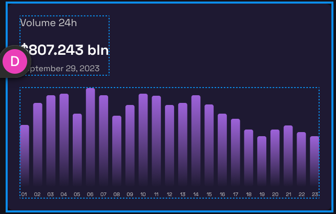
can someone please shed some light here: what bar chart properties in datasets do i need to change to get bars looking like in the figma? I have tried barpercentage, barThickness, categoryPercentage, separate, altogether...nothing helps! what am i doing wrong? second image is how mine looks like 🥲 aghhh, these charts will make me pull my hair out ! also, for the tooltip, has anyone implemented an external HTML tootip? I guess I would have to as it allows for better control over styling, but just asking
3
2
New comment 2h ago

1 like • 5h
Heey 👋 what value did you set on the data property in dataset ? is it an array ? and is that array from the api response ? Assuming this is true, I think the problem may be with the "days" part of the url for the api. Try setting it to 30 and then I think you'll get the desired look. For example : This is the url I use to get the chart data https://api.coingecko.com/api/v3/coins/bitcoin/market_chart?vs_currency=usd&days=30&interval=daily"; Docs : https://docs.coingecko.com/v3.0.1/reference/coins-id-market-chart if you click on this link it'll take you to the docs for this url i used. and if you look on the right you'll see the responses you get from the api call. 3 properties that each hold the value of an array e.g prices , market_cap , total_volume ect Basically the number of days you set will determine the amount of numbers the arrays are populated with, if you set the number of days to a high number then the array you set in the chart will have many numbers in it and then the chart will appear like the pic on the right if that makes sense :D sorry not the best at explaining things but i think this will get you in the right direction :D
Potential solution for 429 status code
@Cristian Florea do you have any experience with something called Throttling ? I asked chatGPT for potential solutions for that status code and it mentioned Throttling. Thought i'd ask about it to see if you have any knowledge. Gonna try implementing it.
2
4
New comment Oct 17
1-10 of 72
@stephen-kasolo-4756
I'm Stephen, I want to become a top notch developer so I can provide a good life for me and my family and also send a friend of mine to university
Active 5h ago
Joined Sep 23, 2023
powered by


