Cors Error
I just signed up for crypto api in coingecko website and made a free account. I used the api key for my crypto app but i am getting this cors error while making too many requests. Does anyone know how to get rid of this? Or is it because coingecko only allows 20 api requests per minute?
4
4
New comment 45m ago

Crypto App notion file
Hey everyone, could someone please share the notion file for setting up tasks for the crypto app. I can't seem to find the link for it anywhere.
4
6
New comment 11h ago
chart help
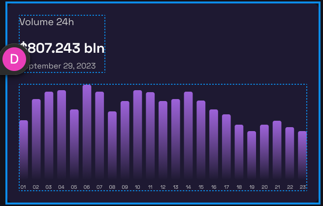
can someone please shed some light here: what bar chart properties in datasets do i need to change to get bars looking like in the figma? I have tried barpercentage, barThickness, categoryPercentage, separate, altogether...nothing helps! what am i doing wrong? second image is how mine looks like 🥲 aghhh, these charts will make me pull my hair out ! also, for the tooltip, has anyone implemented an external HTML tootip? I guess I would have to as it allows for better control over styling, but just asking
5
6
New comment 3d ago

I don't even know what this is
Does anyone have any idea why this is happening? It never happened before. That I can tell it's not doing anything or hindering anything. It's more just annoying to see it keep popping up when I test code.
2
8
New comment 4d ago

tailwind config not being applied
has someone else confronted with this issue of custom extensions in tailwind.config file not being applied to styles in next.js? whatever I declare in extend object is not applied. I wanted to apply an animation class to a skeleton loader but it fails ... EDIT: it's working, I was not passing the right colours to my animation gradient and also for other classes I was accessing as the key of the class object so if I have extend:{ padding: { "customTop":"3.5px" } } I was reading p-padding-customTop instead of just p-customTop
4
12
New comment 5d ago

1-30 of 600

skool.com/developerpro
Learn how to code. Make money. Have fun. Enjoy life.
powered by


