Write something
Enrichment?
What's the status of the enrichment category? How can I find them? I was not able to locate any enrichment options, at least partly due to this UI/UX issue. That Platform field should be optional, so that we can survey all available options in a category, before picking a platform.
0
0

rocketscraper in google maps
Please add this!!! Also is there a way to scrape with linkedin sales navigator link like with phantombuster?
1
2
New comment Oct 24
Export Companies Identified by Linkedin Pixel
Need something like this: https://www.dropcontact.com/blog/identify-companies-visit-b-to-b-website-for-free
0
0
Finding My Automation
So, I created YouTube Videos Scraper, and it's reading my GSheet, and pulling 10 videos for a test. I don't see a Save button, and there appears to be no way to find the automation or the result without knowing the URL. What gives? I haven't seen the overview video for a couple of months, but it wasn't so hard in v1 to find your work. What am I missing? I think the UI needs a review.
1
3
New comment Sep 24
Nonsensical UI in Workflows
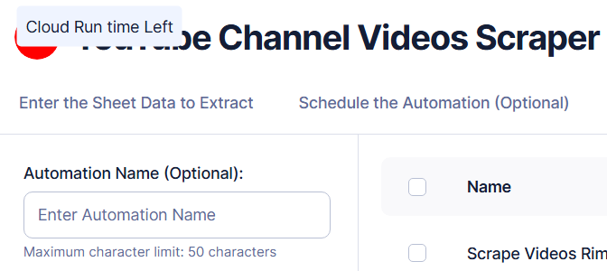
This workflow does have a name, as you can see on the right in the list of runs. So Automation Name (Optional): makes no sense. The big YouTube Channel Videos Scraper is inappropriate, as it's only a tag, the TYPE of workflow, not the name, which is the more relevant thing. I think the right UI here is that the latter is demoted, smaller and labelled like Type : YouTube Channel Videos Scraper, that the actual name I gave shows at the top in that bold font, and that the Automation Name (Optional): block be removed. There should be a pencil icon to edit the title.
0
0

1-12 of 12

skool.com/texau-data-and-ai-for-sales-5684
TexAu V2 Community: Scale your sales using the power of Data, Automation and AI.
powered by


