Activity
Mon
Wed
Fri
Sun
Dec
Jan
Feb
Mar
Apr
May
Jun
Jul
Aug
Sep
Oct
Nov
What is this?
Less
More

Memberships

Skool Masterclass (Free)

Private • 86.8k • Free

Adonis Gang

Private • 167.7k • Free

Growth Writer

Public • 391 • Free

The Founders Club

Private • 37.6k • Free

High Ticket eCom Kickstart

Private • 12.5k • Free

Agency Accelerator

Public • 3.2k • Free

DTC Owner

Private • 36 • $1/m

WeScale (Free)

Private • 8.6k • Free

Alpha Accountability

Private • 454 • Free

21 contributions to Growth Writer
Day 34
Referral Email for Canada Goose . How is it ?
6
6
New comment Apr 18
Day 34
1 like • Mar 21
This is gooodddd🔥🔥
0 likes • Mar 22
@Bibek BhandariYeah, consider using bold text or a different color from the brand palette for important elements, like ‘25% off’.
Day 33
Post-purchase email with upsell for Canada Goose . Is it too much upsell for a post purchase email ??Do let me know how it is.
2
1
New comment Mar 18
Day 33
1 like • Mar 18
The text part on the hero image is a bit difficult to read. You can use opacity on the image. Clean design nevertheless.
Design for Sephora
[attachment]
5
2
New comment Mar 18
Design for Sephora
1 like • Mar 18
The buttons look a bit tight, and I personally wouldn’t use differently colored CTAs. Also, there are too many CTAs; ideally, one email ➡️ one CTA. There are five in the design, which confuses the subscriber on what to do.
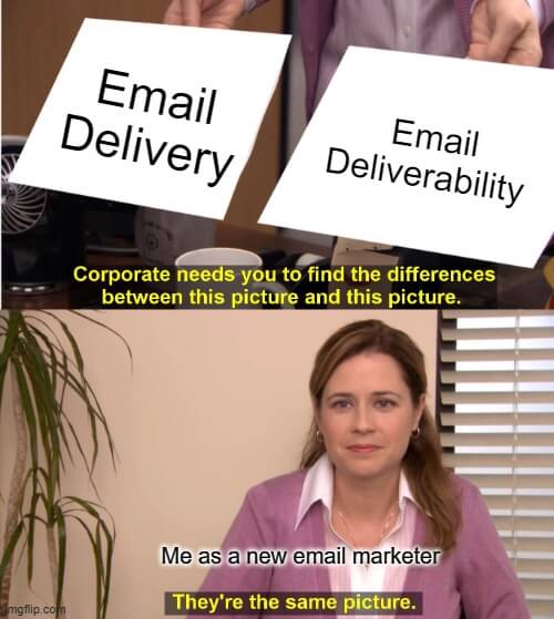
MeMe talks
Who here knows the difference?
3
1
New comment May 30
MeMe talks
Day 32
Made a product intro email design for Canada Goose . Let me know how it is
0
9
New comment Mar 15
Day 32
1 like • Mar 15
@Bibek Bhandari simply said, there must be a button without the subscriber having to scroll the email. cause 80% don’t.
1 like • Mar 15
@Bibek Bhandari here to help🦾
1-10 of 21
Sujal Shrestha
3
39points to level up
@sujal-budanilkantha-4527
I transform Businesses into BRANDS by converting conversations into conversions.

Active 34d ago
Joined Feb 29, 2024
INFJ
powered by